The Writer, The Spy And The Silver Beast: John Gardner’s 007

John Gardner’s first published book was the autobiographical Spin the Bottle (1964), and while he never returned to non-fiction writing, he set out to bring reality, the real world, and a sense of verisimilitude into his work – especially to his fourteen original James Bond novels.

Gardner cited his eleventh Bond novel, 1991’s The Man from Barbarossa, as the best of his 007 adventures. Crucially, this is the story most grounded in then-current events, with Bond thrown into the very timely Middle East conflicts, as well the book correctly anticipating the close of the Cold War. Despite the thrilling, inventive narratives in his stories, Gardner was no fantasist. In his hands, the world’s most famous secret agent fought for Queen and country in a world readers could relate to.
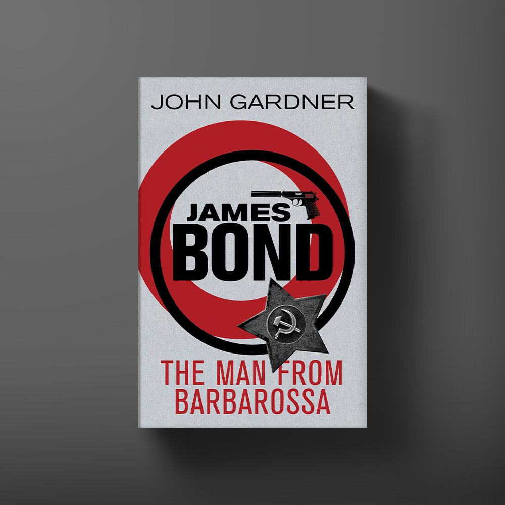
Book cover for The Man From Barbarossa by John Gardner

Having previously worked as both a stage magician and Royal Marine officer amongst other jobs, John Gardner was a hands-on man and it was important to him that the gadgets in his 007 stories be grounded and plausible. In the acknowledgements to 1981’s Licence Renewed Gardner states

“I would like to point out to any unbelievers that all the hardware used by Mr. Bond in this story is genuine. Everything provided by Q Branch and carried by Bond – even the modification to Mr. Bond’s Saab – is obtainable on either the open, or clandestine, markets.”

For his tech research, Gardner spent his own time and money speaking to those in the know and actually getting to handle and experience the equipment on the bleeding edge of covert operations.

“One of the things that he wanted to do right from the word go,” explains John Gardner’s son, Simon, “was to make sure that at least 90% of the gadgets were real and could be obtained.

“At the time he was using a place on South Audley Street called Communication Controls Systems Ltd (CSS) and those were the ones he did a lot of work with. He wanted to show that someone like Bond would have, as he put it, ‘trade craft’. I think he wanted to try and get Bond to become a real person as opposed to this kind of fantasy character: he was trying to bring him back to the reality of espionage. There were a lot of fans who didn’t like that. They simply wanted to see the Bond of the films… He said, if I’m going to do Bond I want to try and do it as much my way as possible, which means that the trade craft has to be right and the gadgets have to be believable. That was his starting point.”

It is the aforementioned Saab that is one of John Gardner’s most famous contributions to the 007 canon. Motoring and James Bond’s licence to drive has always been an essential and beloved part of the adventures and the decision to put him into the Swedish automobile classic turned a lot of heads in 1981. The very first sentence Gardner writes Bond into in Licence Renewed, has him driving the mid-size, four-cylinder car.

“James Bond shifted down into third gear, drifted the Saab 900 Turbo into a tight left-hand turn, clinging to the grass shoulder, then put on a fraction more power to bring the car out of the bend.”

007’s car of choice was named ‘The Silver Beast’ and was of course equipped with special hidden features, such as bulletproof glass, rotating licence plates, tear gas ducts, steel-reinforced bumpers, hidden compartments for handguns, a mobile phone and much more. In the prose, Gardner namedrops CCS as the company who personalised the car for Bond but to further underline that the world of James Bond was now ‘our world’, Saab went ahead and created The Silver Beast themselves. This one-of-a-kind machine made the regional news, with John himself showcasing its bespoke additions.

Not only was this a wonderful marketing opportunity but it spoke to how so many fans of 007 see the character – as aspirational. You may not be taking on globe-trotting missions, but you can drink the drink, wear the suit and now buy the car!  

Gardner was tasked with bridging the gap between an idealised pop culture version of James Bond circa the early 1908s and a readership that was very different to 1953 when Casino Royale was published. In total he would write fourteen original Bond novels, plus two movie novelisations, landing him a spot in the Guinness World Records. “History is moving pretty quickly these days” said Ian Fleming and – like so many situations Bond finds himself in – John Gardner was in the right place at the right time, making him the perfect author for 007 in 1981.
Interview: Comic Artist, Jason Masters

We catch up with Jason Masters, South African artist responsible for the 007 comic book series’ VARGR, Eidolon and Black Box, to find out about his work, his collaboration with Warren Ellis and time with James Bond.

Are you a fan of the Bond universe?

I’m pretty sure I was hooked after the first cold open in the film Octopussy. It introduced me to the idea that there were other 00’s and that they could die. How was Bond going to defeat a villain that 009 couldn’t handle? Surely he was better than 007? He was 2 whole numbers above Bond! At least that’s how my kid’s brain interpreted the information. I loved it and made my way backwards and forwards through the catalogue from there.

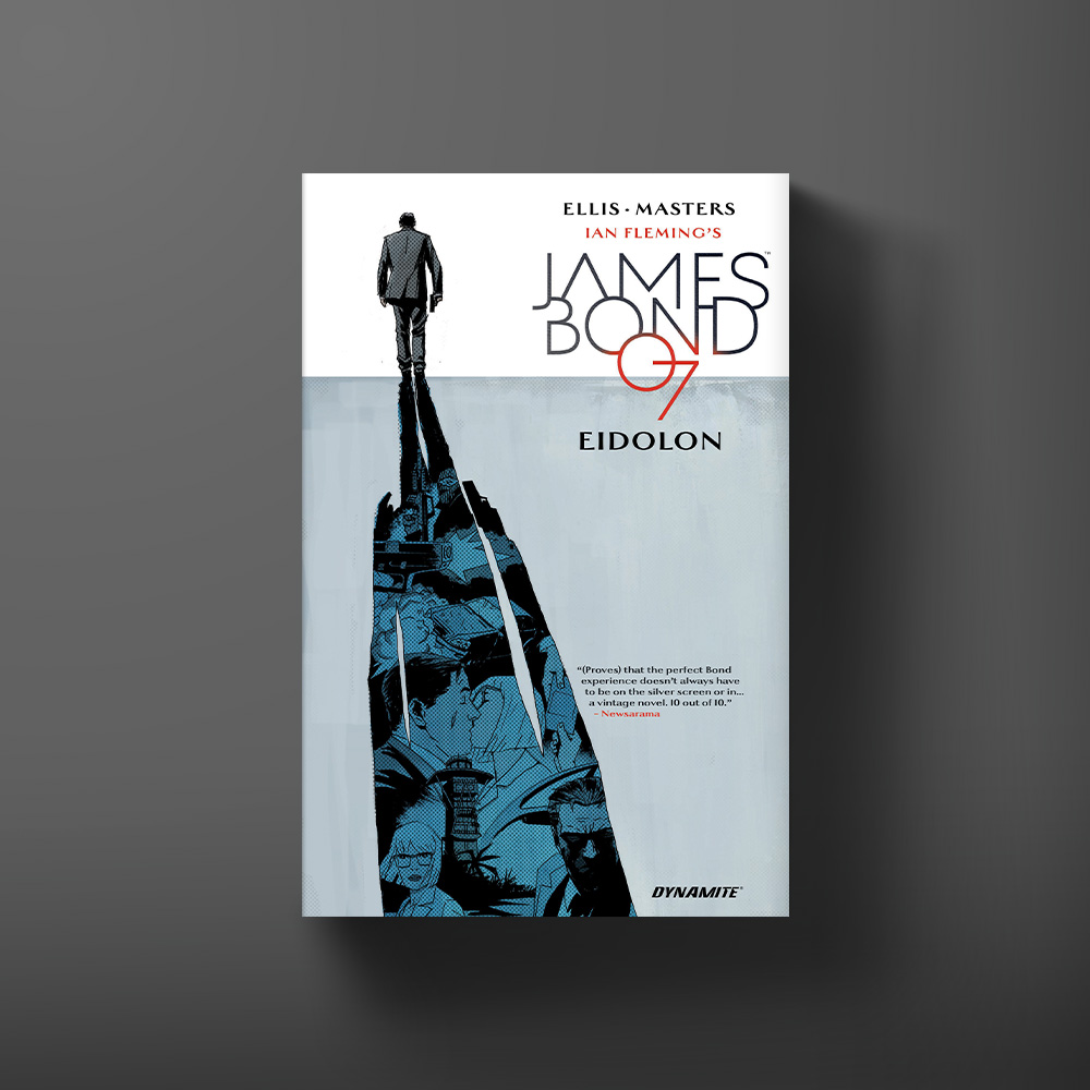
Cover for the Eidolon graphic novel written by Warren Ellis, with art by Jason Masters.

How did you go about creating Bond’s look for VARGR? 

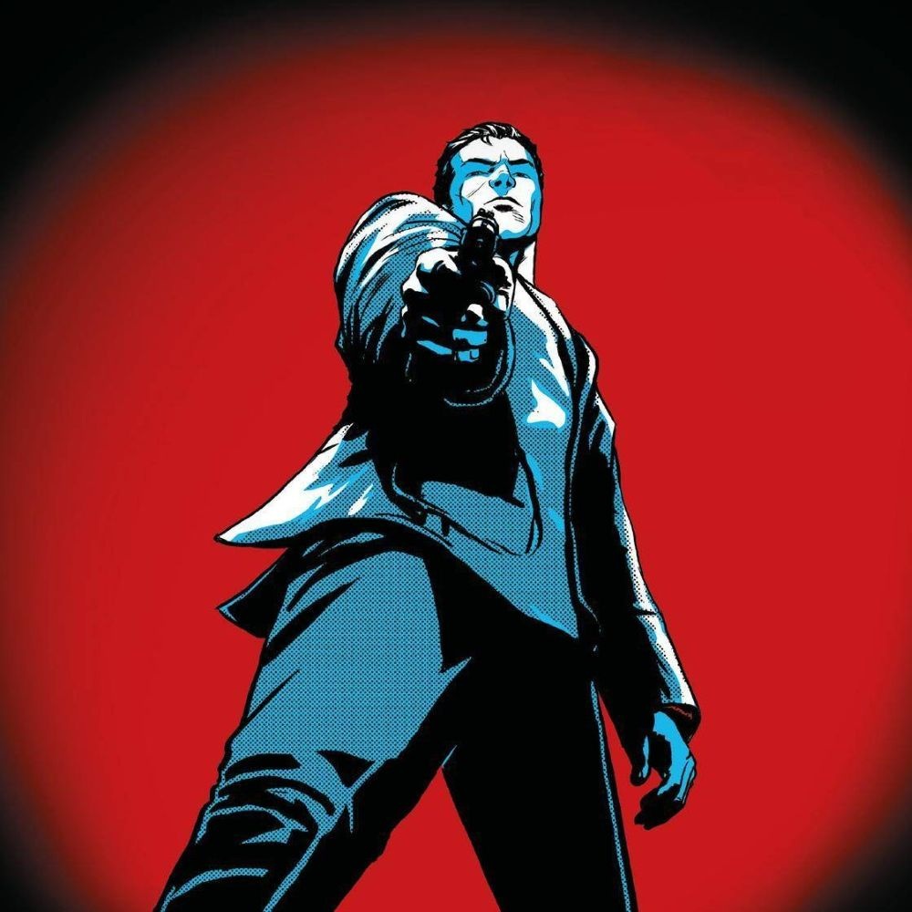
If James Bond hadn’t been played by so many different actors, the design process would probably have been a lot easier. There were times I’d sketch something, come back, and realise I’d drawn Timothy Dalton or Sean Connery. I thankfully got to bounce a few ideas off Warren in the beginning and that was incredibly helpful. In the end, starting with the actor Hoagy Carmichael as a base got me to where I am now. I easily did 20+ versions of Bond’s look before everyone was happy. Everyone has an idea of how Bond should look and pleasing everyone is very difficult.

I spent quite a lot of time thinking about 007’s body language. How would someone who is, almost certainly, the most dangerous person in the room carry himself? There would be a confidence there, not arrogance per se, but comfort in almost any situation. At any point, wherever he is at the time, it certainly isn’t the worst thing he’s been through that day. ‘Comfort’ within his surroundings might be too strong a word but any situation in which his environment isn’t trying to murder him must be quite a relief.

Bond might appear quite simple at face value but his aesthetic choices seem to say he’s a man who could be dead at any point, so why not experience the finest the world has to offer? He’s sometimes a killer dripping with brutal character.

What’s it like collaborating with the legendary Warren Ellis?

I’ve wanted to work with Warren for a long, long time. I never quite dreamed I’d get the added bonus of first working with him on a character so tremendously iconic. He’s a very generous creator, allowing me to throw in the occasional storytelling idea and answering my inane questions succinctly. He could have been a horrible monster to work with and I would still have come out of this smiling. It’s been quite the opposite experience in fact.

Was there anything he asked you for which was too crazy to draw?

Definitely not! To paraphrase Robert Crumb, ‘it’s just lines on paper’. I don’t think you could ask me to draw anything that was too crazy, difficult, sure but that’s the job. One of the most satisfying parts of the comic drawing process is the problem solving.

Can you talk through the style and atmosphere you have in mind when you sit down to draw these Bond stories – and how you use layout to reinforce that?

My pre-comic background is in advertising, art direction and design. From there I moved to commercial illustration and as a result, I like to approach a project by first trying to figure out a look for it. It’s a habit I can’t break but it does get me into what I think is the correct headspace for each job.

I did quite a bit of research on the old James Bond newspaper strips. I thought it would be fun to take the look and feel of that but give it a modern storytelling twist. Then if possible throw in a little bit of the grandeur that is present in all the settings of the films.

These are all the ingredients I tried to throw into the pot. What I achieved was nowhere near what I aimed for but I got close enough for me to at least feel I had made something enjoyable for the reader. Thankfully Dynamite also agreed to let me bring Guy Major on board for the colours and he’s been a great collaborator. Seeming to know exactly what I was trying to do from the start.

We love the crisp realness of the settings and the architectural detail. Is this something which has always been a component of your style? 

There’s probably always been an element of that in my work. I want backgrounds to be characters that are influenced by how the characters react to them. Unfortunately, the only way I know right now to make environments believable is to add details.

How do you approach the action and intense gore of Warren’s scripts? 

Warren writes action exactly how I like to draw it. While I love bold over-the-top superhero action I believe there’s also a place for violence with immediate consequences. I love depicting the almost chess-like moves and decisions a character has to make in a fight to get the results he wants. Bond is the most like this of all the characters I’ve ever drawn. Using what’s around him to get the job done with the least amount of attrition. That’s not always possible of course and sometimes he gets hurt. Violence is ugly and brutal and in these stories it shouldn’t be elevated. Violence without consequences is dancing. I’m not sure there’s a comic artist out there that doesn’t giggle to themselves, at least a little bit, when they have to draw something gross.

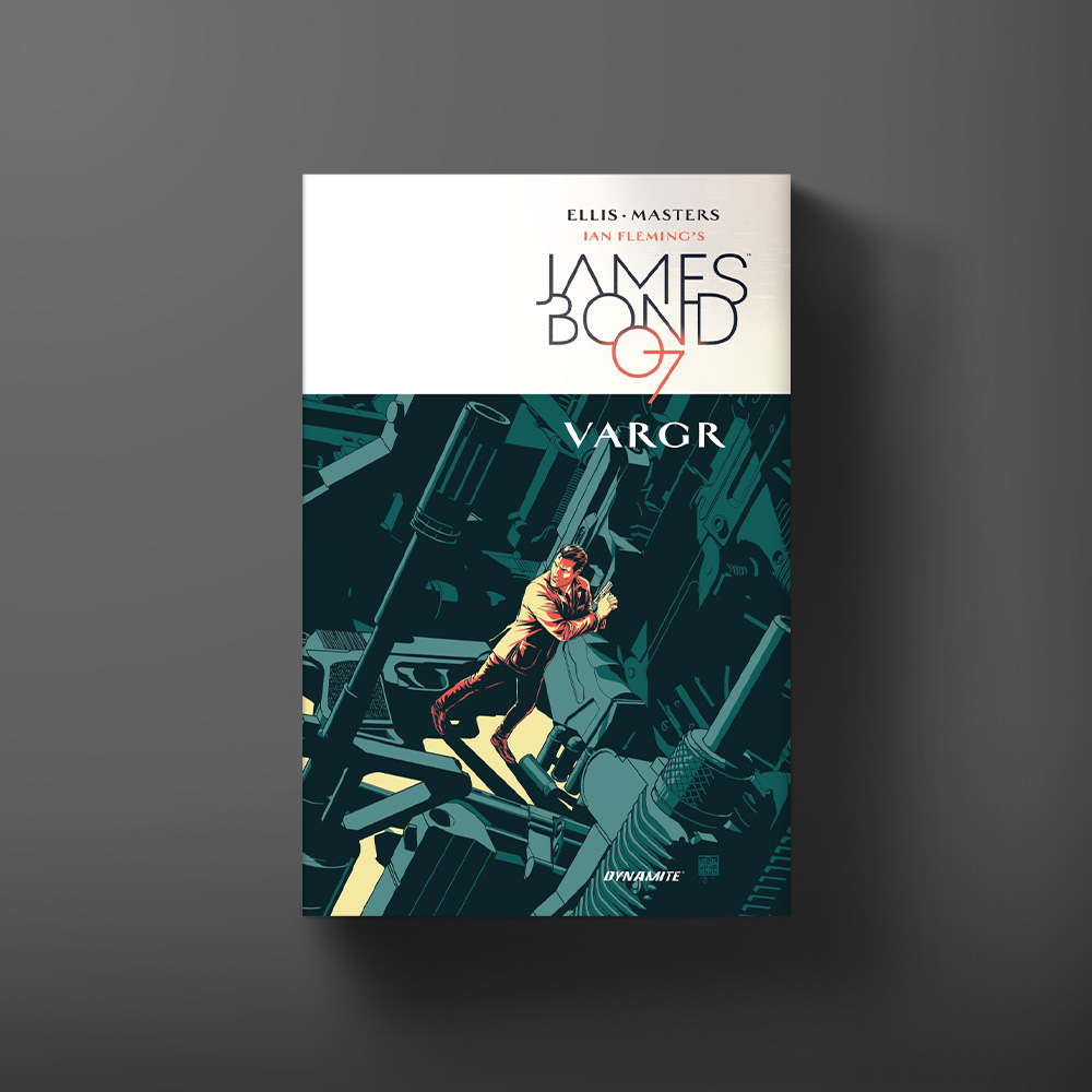
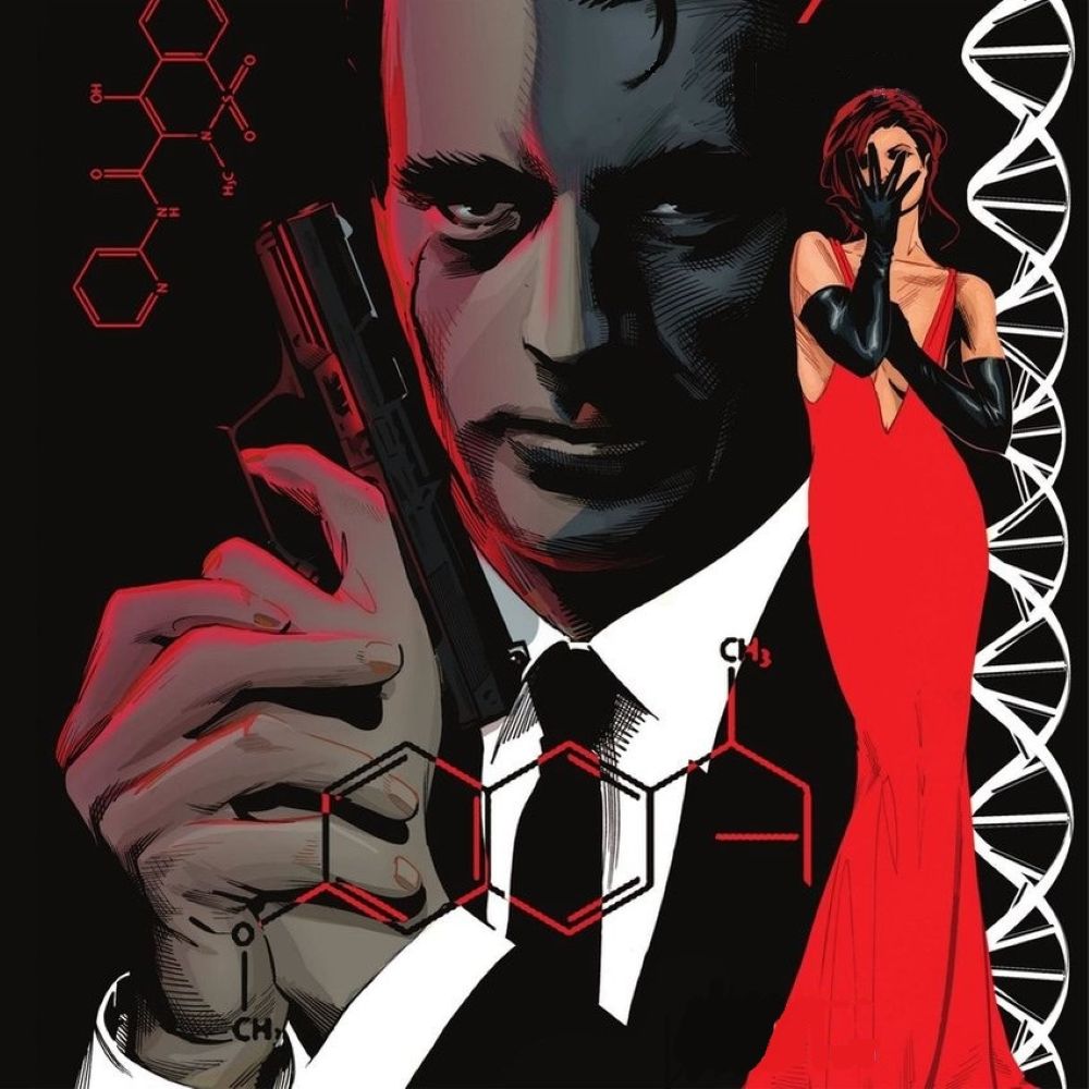
Cover for the VARGR graphic novel written by Warren Ellis, with art by Jason Masters.

Can you talk about your variant cover for issue #1? Were you given any sort of brief, or was it purely a case of constructing an image which embodied the spirit of this new Bond iteration?

Dynamite has been great with letting me try out ideas. I wanted an image with a minimal colour palette that would stand out on the comic shelf. In Bond’s hands anything could be a weapon: walls, furniture etc. So the idea was an environment made out of weapons while he, a weapon made flesh, stalked or was stalked by his prey. I think it turned out pretty well.

And finally, is the character Masters in the comic, a total coincidence?

Ha! I actually asked Warren that exact question when I got the first script but it turns out he hadn’t realised he’d done it. I think subconsciously, knowing Masters’ end, Warren might have wanted me dead for harassing him about working together.

Find out more about Jason Masters here.