
Interview: Anthony Horowitz

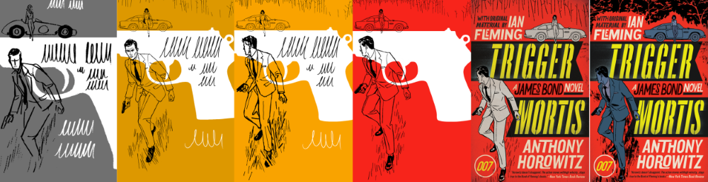
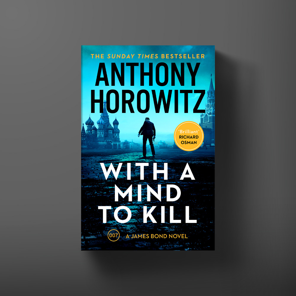
We meet British author Anthony Horowitz to talk literary inspiration, Ian Fleming and James Bond. Anthony has written three official James Bond continuation novels, Trigger Mortis (2015), Forever and a Day (2018) and With a Mind to Kill (2022), all of which draw on original material by Ian Fleming.

What was the greatest challenge involved in writing a Bond novel?

I’ve been a James Bond fan pretty much all my life and I suppose the greatest challenge, for me, was meeting my own expectations. It’s not just that he’s such an iconic character. I think people forget just how good a writer Ian Fleming was. He came up with amazing set pieces, wonderful action sequences, memorable characters. How could I possible write as well as him?

Black and white photograph of author Anthony Horowitz. He is a smiling middle aged white man wearing a suit jacket and baseball hat.

Why did you to choose to keep Bond in his original time period?

Bond represents a particular sort of man at a particular time. He is the ultimate spy at a time – the Cold War – when spying mattered most. He brings with him all the best values that we associate with the Second World War but he has the coldness and ruthlessness demanded by a new atomic age. He is an amazing character who epitomises the age he lived in, which is why, for me, it was critical to keep him in his original timeline.

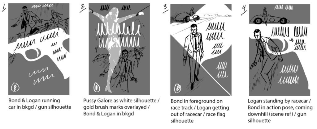
How did you conjure up Trigger Mortis‘ wonderfully sinister Jason Sin and his Korean War backstory?

Getting the villain right in a James Bond novel is perhaps the biggest challenge of all. Make him too monstrous, too extreme, and you risk slipping into parody. And yet he/she has to be somehow larger-than-life. At the end of the day, what matters most, I think, is that the villain should be real and believable. It struck me that although both Hugo Drax and Goldfinger employed Koreans, there had never been a major Korean villain in a James Bond novel. Looking at the history of Korea, I stumbled upon the massacre at No Gun Ri. At that moment, I knew I had my villain, a man with every reason to hate the West.

Book cover for Forever and a Day by Anthony Horowitz.

In Fleming’s James Bond books are there any phrases you wish you’d written? Or that you feel particularly embody the spirit of a Bond novel?

There are dozens of lines and phrases that I wish I’d come up with myself. That was Fleming’s genius. The 007 designation, the licence to kill, the names of the characters (M, Miss Moneypenny), the unforgettable titles – it’s impossible to do better.

Do you have a favourite phrase/sentence of your own from Bond series?

My favourite line in Trigger Mortis – because it really does capture Fleming’s style, is the line that opens Chapter 24. ‘Rain swept into London like an angry bride.’ I’m not sure what it means. Or why it works. But when I read it, it makes me smile.

Book cover for With a Mind to Kill by Anthony Horowitz.

How has the process of writing Bond differed from that of your revival of another British literary legend, Sherlock Holmes?

There’s not much comparison – except that I have an equally healthy respect for Sir Arthur Conan Doyle. Sherlock is so much more distant that I didn’t feel quite so nervous writing about him. Late Victorian England is easier to characterise than the 1950s. I’d add that in the end I enjoyed writing the books equally. If you’re going to write a continuation novel, it helps to love the world into which you’ve been invited.

Which authors have influenced you the most and inspired you to become a writer yourself?

Obviously, Doyle and Fleming. I read both of them when I was a boy, dreaming of being a writer. Other influences were Charles Dickens and Tintin’s creator, Hergé.

Discover more about Anthony Horowitz here.

Interview: Illustrator, Patrick Léger

We check in with New York-based illustrator Patrick Léger who created the art for the US paperback edition of Anthony Horowitz’s Trigger Mortis.

What was your first encounter with James Bond?

My mother was a huge Timothy Dalton fan, and I remember watching our VHS of The Living Daylights constantly, growing up. I’m a bit of a movie buff so I’ve seen every Bond film. From Russia With Love is one of my favorite movies from the ’60s.

Your cover is a gorgeous hark back to Bond’s ’50s and ’60s origins – could you tell us about your inspirations?

When I was asked to do Trigger Mortis, I had just finished another spy novel cover a few months earlier and was currently working on an assignment for a men’s fashion magazine, so a James Bond cover seemed like a inevitable next step! The scene for the cover didn’t require too much research but I tried to make the fashion, hairstyles, and other details appropriate for the period. I referenced several of the earlier Bond films, which are a treasure trove for the look and the style of the ’60s. I did look at some of the original Bond covers, but I was more enamored with Robert McGinnis’ posters for the films and his own incredible covers for various crime novels of the ’60s and ’70s.

What originally drew you to the style of the ’50s, ’60s and ’70s?

When I first began illustrating, I was working in ink and looking at a lot of work by the illustrators from the 60s and 70s to study mark-making and learn more about the medium. Their techniques of drawing and that kind of generalised realism made it’s way into my own work and became a strong aspect of my own style.

How did this cover process differ from independent artwork projects?

Not being able to show Bond’s face was an interesting challenge. Typically you have those kinds of limitations with any book now though because marketability has become a big part of the process. I think overall it was actually easier to work on this than a typical book cover. James Bond is such an iconic character; you don’t really need to convey to the reader as much as you normally would. They already know what to expect from a Bond adventure.

How does the process for covers differs from other pieces of illustration?

Often with books, the art director will describe a rough concept, because the book may still be in the editing phase or there isn’t enough time for the illustrator to read through the entire text before the sketches are due. Here I believe the scene used was chosen by the Ian Fleming Estate. With editorial work, it’s usually entirely up to the artist to come up with multiple concepts for an article from which the editorial staff can choose a direction.

Your style always includes a striking palette – can you talk us through your colour decisions for Trigger Mortis?

The color choice was mainly up to the art director/designer in this case. We worked together doing various combinations and landed on those. The original idea was to use very limited color, so we tried to find 3-4 colors that would work in conjunction with the title design. I often use brighter colors because it helps to set off the the heavy, black linework in a way that a muted color scheme wouldn’t.

Explore Patrick Léger’s work here.