NEWS
Interview: Illustrator, Patrick Léger
BECOME A FLEMING INSIDER > JOIN HERE
Interview: Illustrator, Patrick Léger

Posted on 22 September, 2016
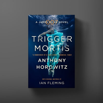
We check in with New York-based illustrator Patrick Léger who created the art for the US paperback edition of Anthony Horowitz’s Trigger Mortis.
What was your first encounter with James Bond?
My mother was a huge Timothy Dalton fan, and I remember watching our VHS of The Living Daylights constantly, growing up. I’m a bit of a movie buff so I’ve seen every Bond film. From Russia With Love is one of my favorite movies from the ’60s.
Your cover is a gorgeous hark back to Bond’s ’50s and ’60s origins – could you tell us about your inspirations?
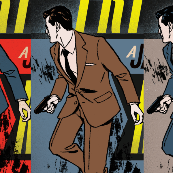
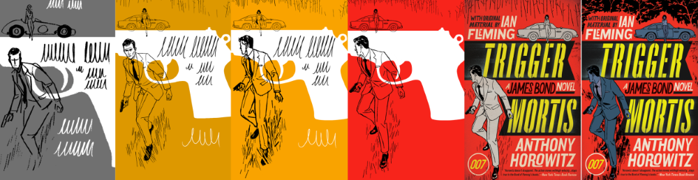
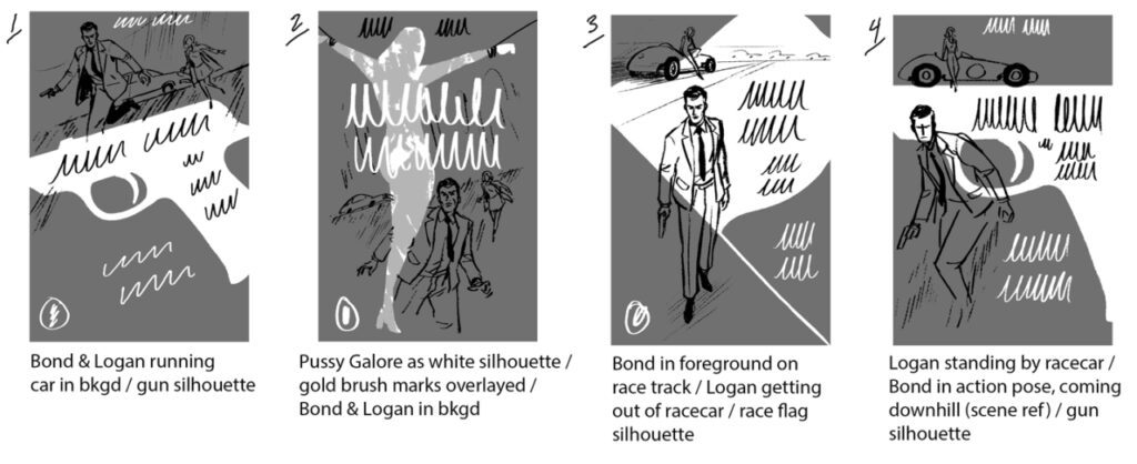
When I was asked to do Trigger Mortis, I had just finished another spy novel cover a few months earlier and was currently working on an assignment for a men’s fashion magazine, so a James Bond cover seemed like a inevitable next step! The scene for the cover didn’t require too much research but I tried to make the fashion, hairstyles, and other details appropriate for the period. I referenced several of the earlier Bond films, which are a treasure trove for the look and the style of the ’60s. I did look at some of the original Bond covers, but I was more enamored with Robert McGinnis’ posters for the films and his own incredible covers for various crime novels of the ’60s and ’70s.
What originally drew you to the style of the ’50s, ’60s and ’70s?
When I first began illustrating, I was working in ink and looking at a lot of work by the illustrators from the 60s and 70s to study mark-making and learn more about the medium. Their techniques of drawing and that kind of generalised realism made it’s way into my own work and became a strong aspect of my own style.
How did this cover process differ from independent artwork projects?
Not being able to show Bond’s face was an interesting challenge. Typically you have those kinds of limitations with any book now though because marketability has become a big part of the process. I think overall it was actually easier to work on this than a typical book cover. James Bond is such an iconic character; you don’t really need to convey to the reader as much as you normally would. They already know what to expect from a Bond adventure.
How does the process for covers differs from other pieces of illustration?
Often with books, the art director will describe a rough concept, because the book may still be in the editing phase or there isn’t enough time for the illustrator to read through the entire text before the sketches are due. Here I believe the scene used was chosen by the Ian Fleming Estate. With editorial work, it’s usually entirely up to the artist to come up with multiple concepts for an article from which the editorial staff can choose a direction.


Your style always includes a striking palette – can you talk us through your colour decisions for Trigger Mortis?
The color choice was mainly up to the art director/designer in this case. We worked together doing various combinations and landed on those. The original idea was to use very limited color, so we tried to find 3-4 colors that would work in conjunction with the title design. I often use brighter colors because it helps to set off the the heavy, black linework in a way that a muted color scheme wouldn’t.
Explore Patrick Léger’s work here.